CLIENTBE SEMBOL
INDUSTRYJEWELRY
ROLECONCEPT / FEED DESIGN / VISUAL LANGUAGE
PLATFORMINSTAGRAM
JEWELRY BRAND
Be Sembol
FEED DESIGN · VISUAL LANGUAGE
SHORT DESCRIPTION
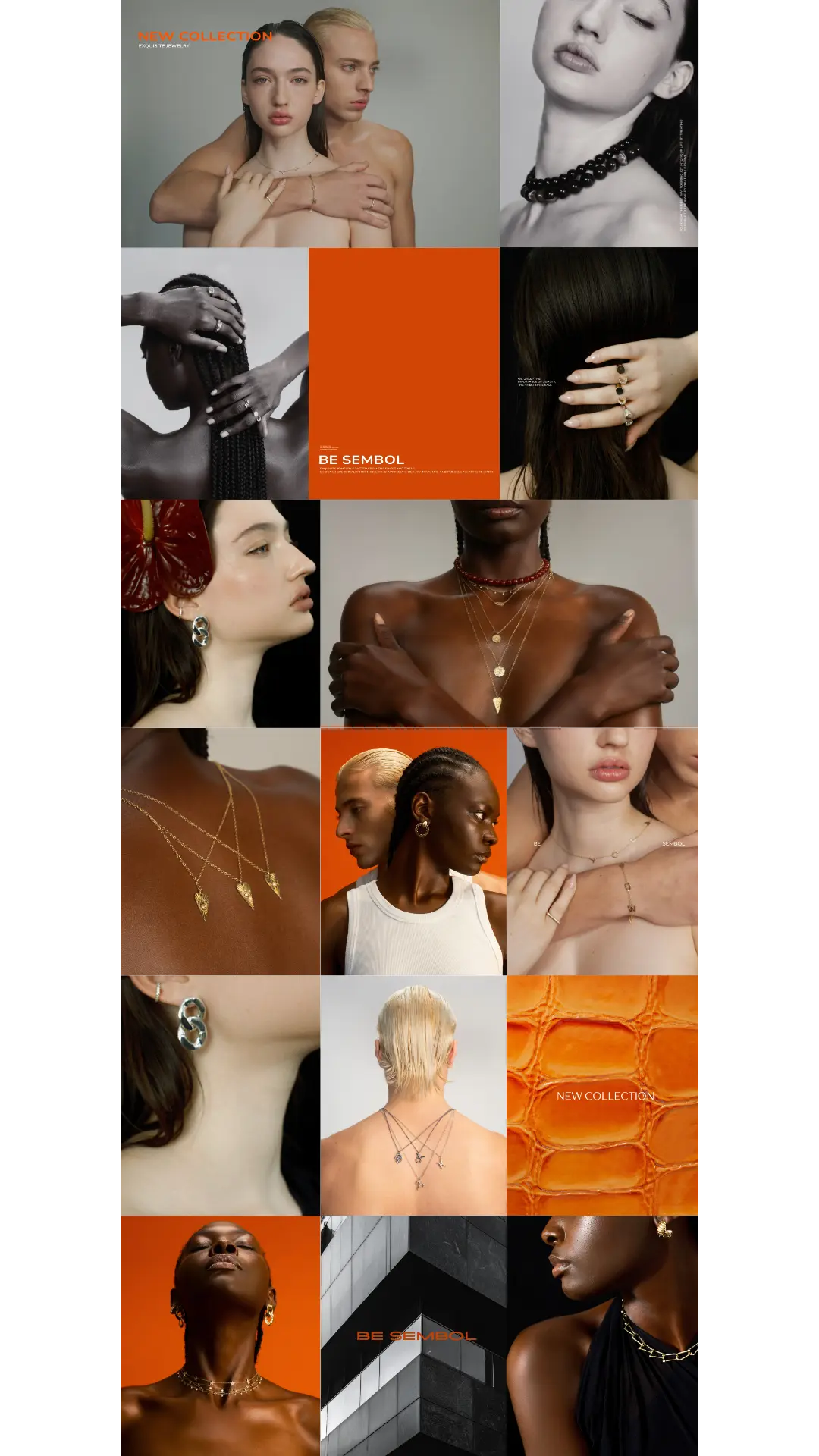
Be Sembol is a jewelry brand with a distinctive design language and a clear visual identity. The project was built as a focused concept for the brand's Instagram presence: a refined feed system that shows how the jewelry can live and move inside social media.
The direction combines clean product moments, close body crops, editorial portraits and warm orange brand accents. The result is a cohesive visual world: premium, feminine, minimal and memorable, with every post designed to feel like part of the same story.
Concept note: created within a specific Oart Studio framework, not as ongoing brand management work for Be Sembol.
FEED DESIGN
Ready for a next form?
START A PROJECT →NEXT PROJECT